
High Tier Normie: Where It Sits on the Full Tier Ladder
High tier normie means better looking than most men, short of model-adjacent — roughly 5.5-6 in forum convention. Here is the full ladder, and the trap.

You saw the chart in a feed somewhere: a lineup of male faces sorted left to right, labels underneath climbing from cruel to flattering. You traced across, matched yourself honestly, and landed on the band marked "high-tier normie."
And you sat with it for a second, unsure whether you'd just been complimented or dismissed.
That confusion is the design. Here's the direct answer: a high-tier normie, in the tier-chart meme the term comes from, is a man who is clearly better looking than most men — above average by any honest read — yet short of the rare top tier. The label's real function is to convert "above average" into "not quite enough."
TL;DR
- HTN = clearly above average, short of model-adjacent. In forum convention it sits around 5.5–6 on the PSL ladder, one rung below Chadlite.
- The full ladder: Sub-5 → low-tier normie → mid-tier normie → high-tier normie → Chadlite → Chad → PSL god. Table below.
- No percentage exists. The chart was drawn, not measured, so any "top X%" figure attached to it is invented.
- Factually it's good news: in most rooms, most men present are less conventionally attractive than you.
- The trap: forums swap your comparison set for the most photogenic faces online, so above-average reads as failure.
Note on sourcing: everything below describes forum convention as last checked in September 2026, and boards disagree at every boundary.
What does high tier normie mean?
High tier normie means a man who is clearly better looking than most men — comfortably above average — but short of the rare top tier the forums reserve for one-in-a-generation faces. That is the whole definition, and notice what it concedes before it insults you: the "high tier" part is a factual compliment, and the "normie" part is a mood. The band directly above this one has its own page, with the research on how much raters actually agree: Chadlite. If a tool rather than a thread handed you the label, read what mog check tools actually score before you believe it.
The term comes from a tier-chart meme that borrows the 1–10 decile convention rating forums already used. The convention it borrowed from — what each number is ordinarily taken to mean, and why the decimals are fiction — is laid out in our guide to the 1-10 attractiveness scale.
And it does not exist outside those forums. No woman, employer, or stranger has ever placed you in this band, because the band only lives on the chart.
Where does HTN sit on the full tier ladder?
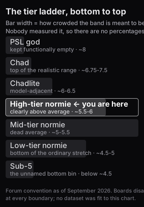
One rung below Chadlite, three above the bottom. The term only means something relative to the rungs around it, so here is the whole ladder in one place, using the same bands as our PSL god breakdown:
| Tier | What forums mean by it | Rough band |
|---|---|---|
| Sub-5 | the collapsed, unnamed bottom bin | below ~4.5 |
| Low-tier normie (LTN) | bottom of the ordinary stretch | ~4.5–5 |
| Mid-tier normie (MTN) | dead average | ~5–5.5 |
| High-tier normie (HTN) | clearly above average, short of model-adjacent | ~5.5–6 |
| Chadlite | model-adjacent; regularly called handsome | ~6–6.5 |
| Chad | top of the realistic range | ~6.5–7.5 |
| PSL god | one in a generation — kept functionally empty | ~7.5 and up |
The bottom rung is the only one named for what it isn't, and its name has since become a TikTok insult; what sub 5 means traces how.
Why the ladder stops near 8 when the scale runs to 10, since it is the first thing anyone notices: the top of this ruler is anchored to generational faces, so an 8 already means "the most photographed men alive." Everything ordinary slides down to make room, and 9 and 10 are left standing empty above the anchor — not a tier anybody is failing to reach, just the headroom the calibration needs in order to keep working. Which is why a "5.5" here and a 5.5 on the ordinary scale are not the same statement; the full comparison is in PSL scale.
High tier normie vs Chadlite: what actually separates them?
One rung, and it is a rung nobody can locate precisely. In forum convention Chadlite starts where strangers begin volunteering that you are good-looking, while HTN is the band where nobody comments either way. That is the whole distinction: HTN is the absence of flaws, Chadlite is the presence of a feature people notice. Boards place the boundary anywhere from 5.8 to 6.3 depending on the thread, which tells you how much weight it can bear. Where it shows up in life is narrower than the argument suggests — mostly in photo-first dating apps, where faces compete side by side, and barely at all face to face.
Why the ladder runs about two points colder than a normal 1–10 is unpacked in the PSL scale explained. If you want a tier of your own without paying for one, free PSL rating lists every route that costs nothing, and looksmax rating explains why the app, the forum and the chatbot will hand you three different answers.
Notice the shape of it. The ceiling is defined as unreachable — forums argue working supermodels out of the top rung — which by construction makes every band beneath it, yours included, read as "almost."
What does an HTN actually look like?
Not a face we're going to name. The honest way to answer is to describe how the boards themselves talk, because HTN is a description pattern before it's a measurement — and rating real, identifiable people is exactly the habit this article is arguing against.
Here is the description pattern, pulled from how the boards themselves write these up. Read it as a checklist and count your ticks — and as you go, watch for the one thing every line has in common:
- Skin is clear and even-toned. No active breakout situation, no strong redness.
- Hairline is normal and not receding. Whatever the style, it isn't the thing being discussed.
- Jawline is defined enough not to draw comment — neither sharp enough to be an asset nor soft enough to be a flaw.
- Features are proportionate, with no single standout. Nothing is off; nothing is striking.
- A straight-on photo looks fine and unremarkable. No angle rescues it and none ruins it.
- Height gets logged as average-to-tall.
Threads almost always add the same two riders — that he "looks better in person than in photos," and that he'd "do well with better grooming and clothes."
Tick four or more and you're describing what the boards call HTN. And there is the thing you were watching for: every item is an absence of a flaw, not the presence of an exceptional feature. That is the entire content of the tier. HTN is the band where nothing is wrong — which is precisely why the forums find it boring and real life does not.
Notice too what the list can't do: it describes, it doesn't place you. Six items about photographs is not a measurement of a person, and the two riders at the end give the game away — both of them are about things that aren't your bone structure at all.
What does the high-tier normie chart actually show?
The chart exists in dozens of versions, which is the first tell. The common layout: male faces arranged in a row or pyramid, "normie" occupying the wide middle, split into low, mid, and high tiers, with dismissive names below and aspirational ones above. No axes. No sample. No source.
It spreads because of a mechanism worth naming: format authority. Anything arranged in ordered bands with confident labels reads as data, even when nothing was measured. The chart looks like the output of a study. It is the output of someone's afternoon in an image editor. Which is also why any exact "top X%" attached to it is invented — there was never a sample to compute one from.
None of this makes the underlying idea false. Attractiveness ratings are not random noise — Langlois et al. (2000) ran eleven meta-analyses and found raters agree with each other more than chance, within and across cultures, and the chart's rough shape is honest: a crowded middle with thin tails. The dishonesty lives in the labels and cutoffs, not the curve.

Strip the meme names off and the band is simply the stretch above the median and below the thin right tail. Most decent-looking men live there — not because they failed to reach the top, but because that is what a distribution is: crowded in the middle, nearly empty at the edges. Translated out of meme grammar: in most rooms you walk into, the majority of men present are less conventionally attractive than you. The chart phrases that as "almost."
If you'd rather have a measured read than a guess at a drawing, our photo test estimates the first-second impression your face actually creates, with no tier names. The analysis runs before you pay; the $5 full report adds your natural ceiling and who is actually drawn to you now and at that ceiling.
Is being a high tier normie good or bad?
Good, factually — and the label is built to stop it feeling that way. HTN means most men in any room you walk into are less conventionally attractive than you. That is the fact. The feeling that arrives with it is manufactured, and two mechanisms do the manufacturing.
First, the reference-group swap. Your brain calibrates "normal" against the faces you compare yourself to, and forums quietly replace your real comparison set — the men at your job, your gym, your street — with the most photogenic faces the internet has ever indexed. Against that set, above-average reads as failure. Rating culture doesn't change your face; it changes your denominator. The same swap powers the looksmatch fence.
Second, the word itself. "High-tier" concedes the fact; "normie" cancels the feeling. That's the trap: a label that takes "better looking than most men" and makes it land like a consolation prize, so you keep rating instead of living.
Here is the reframe this article exists for — call it the Threshold Rule: real-world attraction runs on thresholds, not leaderboards. The ~100-millisecond read a stranger forms of your face (Willis & Todorov, 2006) isn't ranking you against every man alive; it's checking bars — groomed or not, healthy or not, at ease or not. The HTN band clears every bar that gates real life: hireable, datable, trusted, taken seriously. After that, outcomes are decided by voice, style, expression, presence — the rest of the attractiveness stack.
One arena genuinely does run on rankings: cold-start dating apps, where photos compete side by side. That's real. It is also the least representative arena your face will ever enter.
What should you do with a high-tier normie read?
Four moves, in order:
- Take one measured read and close the loop. The failure mode of tier culture is re-rating yourself weekly. One calibrated data point, then stop.
- Max the first-second controllables — and here is the one to do tonight. A tier chart grades a photograph, so start by fixing the photograph. Stand facing a window during daylight, phone at eye level and roughly an arm and a half away rather than at arm's length, and take two frames: one neutral, one mid-expression. That is it. Window light removes the overhead shadow that adds a decade, eye level removes the angle that shortens a jaw, and the extra distance removes the lens distortion that widens a nose — three of the most common things a band gets docked for, none of which are your face. Compare the result with whatever photo you were being judged on. Then work through the slower list in the same order: sleep, skin, beard line, clothes fit, posture.
- Build the post-threshold axes. Once the bars are cleared, what converts attention is mostly behavioral — warmth, competence, how you hold a conversation. Covered in what women actually find attractive.
- Refuse tier-upgrade chasing. Moving from one meme band to another is not a life outcome. Clearing a threshold you were failing is.
The translation is short. Where the chart says mid normie, invisible and interchangeable, real life says: clears most thresholds once presentation is dialed in. Where it says high-tier normie, almost but not quite, real life says: above average, with every bar that gates hiring, dating and being taken seriously already cleared. And where it says top tier, life on easy mode, real life says: a rare tail whose advantage is concentrated almost entirely in photo-first apps.
If the fear underneath the label is that the band decides your income, the labour-market literature is smaller than the fear. The most-cited estimate is a plainness penalty of roughly 5 to 10 percent, with the premium for being above average slightly smaller than the penalty for being below it — a nudge on a wage, not a tier system that pays out per rung. Where that number comes from, what an experiment found it is actually made of, and why economists still argue about it are in the beauty premium statistics.

If the chart has become a nightly ritual
One thing worth saying on its own, because it doesn't belong buried in a list. If you find yourself back at the mirror most nights re-running the comparison, or reopening the chart to check whether you've slipped a band, the thing to address isn't your placement on it — it's the checking. That pattern is appearance anxiety, it is common, and it responds to real support from someone qualified far better than it responds to a more accurate meme. Closing the tab is a legitimate move, and it is often the right one. If you want the gentler version of this argument first, do face-rating apps cause insecurity is written for exactly that moment.
The bottom line
- "High-tier normie" is the above-average band — roughly 5.5–6 in forum convention, one rung under Chadlite — of a chart nobody ever measured.
- The fact the label names is good news; the frame it ships in is the trap — "above average" repackaged as "not enough."
- The Threshold Rule: real life checks bars, not ranks, and the HTN band clears them all.
- Spend your effort on the controllables and the post-threshold axes, not on tier promotion.
The chart can't place you; it has no input. What you can measure is the read a stranger forms in the first second — that's what our test estimates, and its $5 full report lays out the drivers behind it. It's not a validated clinical instrument; it's one honest data point, which still beats a meme's verdict. Pair it with the self-audit in how to know if you're attractive.
Studies referenced
- Willis, J., & Todorov, A. (2006). First impressions: Making up your mind after a 100-ms exposure to a face. Psychological Science, 17(7), 592–598. https://doi.org/10.1111/j.1467-9280.2006.01750.x
- Langlois, J. H., Kalakanis, L., Rubenstein, A. J., Larson, A., Hallam, M., & Smoot, M. (2000). Maxims or myths of beauty? A meta-analytic and theoretical review. Psychological Bulletin, 126(3), 390–423. https://doi.org/10.1037/0033-2909.126.3.390
Frequently asked questions
What does high tier normie mean on the attractiveness chart?
It is the band on the forum tier-chart meme for men who are clearly above average looking but short of the rare top tier. The chart borrows the 1-10 decile convention from rating forums; the wider ladder behind it is explained in the PSL scale guide. No dataset was ever fit to the chart — it is drawn, not measured.
Is being a high tier normie good or bad?
Factually it is good: it means most men in any room are less conventionally attractive than you. The label only feels bad because forums swap your comparison set for the most photogenic faces online. What converts attention after that point is mostly behavioral, as covered in what women actually find attractive.
What percentage of men are high tier normies?
No honest percentage exists, because the chart was never built from data — any exact 'top X%' figure attached to it is invented. Directionally, the band covers the crowded stretch above the median and below the thin right tail. For a signals-based way to place yourself, see how to know if you're attractive.
What is the difference between high tier normie and Chadlite?
On the meme chart, 'Chadlite' is the band just above HTN — a forum convention, not a measured cutoff. In real life the difference between the two bands mostly shows up in photo-first dating apps, not face-to-face outcomes. The other layers that decide results are covered in the attractiveness stack.
How do I find out if I am a high tier normie?
The chart cannot place you because it has no input — you would just be guessing at a drawing. A more useful move is measuring the read a stranger forms in the first second, which is what our photo test estimates on a 70-155 perception axis. It is not a clinical instrument, but it is one calibrated data point instead of a meme's verdict.